

As you probably know, I am by no means a lettering artist. But, sometimes these skills can come in handy — especially if you run your own blog or social medias and need to DIY some stuff. Plus, hand lettering is just so fun and relaxing. So I wanted to drop a few of the tips I’ve found that have helped me over the years in improving my lettering.
Before we begin: I used exactly two things to make the graphics in this post. One, I used a black Tombow calligraphy pen (not the brushes, but they work pretty much the same). To upload everything online and clean it up, I used Adobe Capture, which is free on the app store and perhaps one of my most prized tools.
The hand lettering tip you might be missing if you’re a beginner
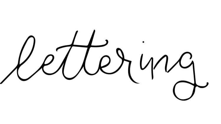
Break your lettering down. Instead of thinking of your letters as a whole, remind yourself that they are made of lines and curves. In the first example below, look at my “e”. They sorta just look like tiny “l”s or loops. That’s because I’m treating it like I’m just moving from the “l” to the “t”. In the second example, the difference is slight, but noticeable. Instead of just looping through, try to mark where you are transitioning from creating your “l” to creating your “e”. So the brush curves up, and then you form your “e”. Instead of one smooth loop, pause and differentiate between the ending of the “l” and beginning of the “e”. The slight change in direction will be hidden on the downstroke of the “e’“. You might have to look to notice the difference, but I think that the “e”s in the second example stand on their own much better.


You’ll also notice that I dropped the connection between my “r” and “i”. Its okay to break apart the words — in fact, its more natural-looking. If you feel like lifting your hand, just let the letter you are on end. It takes some experimenting to get right, so try it out a few different ways.
Learning to bounce your letters
Although it might be great practice when you are first starting off, we don’t always want our letters to look like we carefully traced them between lines. Guides are wonderful, but remember they can be just as helpful when you learn to break from them. “Bouncing” letters is one of my favorites to practice, because it adds a bit more fun to the word, in my opinion. For this one I followed a basic up-down-up-down pattern, but variated a little to balance things out. Again, there are many different ways to do this — pick what you think looks the best!

Fake it til you make it (really, it’s fine)
My third trick is simply faking it. Honestly, it doesn’t look much different in the end. I have a slight hand tremor, and on days when its bad I sometimes have trouble handling a brush pen. For those times, this certainly comes in handy. The idea is pretty simple — write out your letters with a plain pen or pencil like you would if you were lettering normally, but make sure they are a little wider and more definite, as we are going to need room to add the thicker strokes. Once you have your base, just take your pen back over it and thicken the downstrokes. Sometimes this actually works a little better for me, as I think you have a little more control over the detail and balance that the thickness of the lines create, and as someone who is an amateur, this can lessen the pressure of getting it “just right”.
Anyways, while you aren’t coming away from this with all the skills to sell your work on Etsy, I hope that these tips help you level up your hand lettering a little faster than I did. Also, I would love to see any hand lettering you do.
Love,

P.S. — Why yes, this is how I made my signature graphic. You can teach yourself a lot on the internet.